Showing posts with label assignment. Show all posts

Friday, August 29, 2008

Assignment 4: Taste

The 4th photo club assignment was taste... yes, taste. This included everything from food photos to people's emotion/reactions to food, basically anything that could represent taste. The shot I really wanted was to get someone (preferably a girl) to eat some ice cream. I wanted to compose the shot just showing the lower part of her face (chin/jaw) and have the spoon in her mouth, all against a blown out bright white background (well ok maybe some color, but I wanted strong back lighting). You know, the typical "hmmmm that was delicious" look to it where you hold spoon in your mouth, enjoying every second of that wonderful sweet flavor. Thats what I wanted... but I never got a chance to try to execute so I had to settle for plain food photos. Oh well.

I ended up settling for some hot dog shots from work...
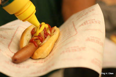
Just a plain shot, I wanted to make sure I got the action of putting the mustard on the hot dog... hey this is TASTE after all :). It might have been better to get the whole hot dog in focus but at the same time I wanted some blurred background so I just settled for making sure the ketchup and mustard was in focus. I also really like the red + yellow contrast... overall the white balance is off by a little bit which kind of sucks (see the that yellowish tint?). Finally, for this shot, I had to make sure the hot dog wasn't centered... I felt that would have been too plain and boring; besides that paper is almost just as interesting as the hot dog!

During the course of the assignment, I was also lucky enough to fly up to the main campus up in Mountain View with all the great cafes... I happened to stay in Building 47 where Pintxo 47, one of the coolest cafes with small tapas styled plates, is located. These little dishes of delight made it the perfect food photography subject...
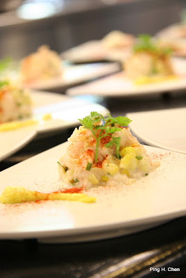
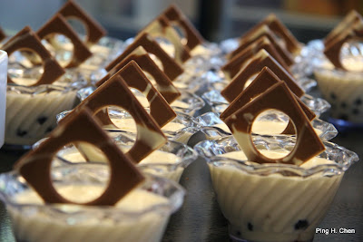
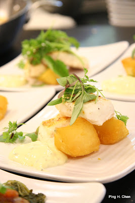

I haven't had a whole lot of experience shooting food... Not really good at food photography or really know what I'm talking about... but a few things that I personally watch out for are:
  • Make sure you have the correct white balance. There is nothing like a yellow (or pale blue) tint on your food photos to destroy your appetite. Make sure that white is actually white... if that fish is white, please don't make it look yellow or orange (yes, I'm guilty of making that mistake...), it just doesn't look right.
  • Don't under expose... I think it is almost always better to OVER expose than to under or expose just right. So error on the side of making things too bright... there is nothing more disgusting than a dark looking photo of red meat... it just makes it look dull, dry, heavy, greasy... But if you brighten it up, it will just look that much fresher, juicier... tastier.
  • Keep the background simple. As with everything else... simplify simplify simplify. The food is the main subject, avoid clutter from the table (i.e. clashing cups, bowls, utensils, etc). While these items could be used to set a context for the food (i.e. wine pairing), make sure you focus on the right things otherwise the viewer's eyes will simply wander around.
  • White plates help... I personally tend to find white plate settings best... white plates + slight over exposure just creates that light fresh feeling. White probably also brings out the colors of the food the best... but again, this is just a personal taste
  • Tilted angles... for some reason, I love my food shots tilted slightly. Angle (eye level? 45 degree looking down? completely top down?) and composition is very important and is something I need to work on, but I find that I always like these tilted photos the best... maybe because they remind of me magazine food photos :p
  • Use lights to bring out the texture... I tend to like a bit of back lighting on food photos (maybe even some rim light). But lighting is definitely something I need to master... when to use a strong directional light, when to use a soft light... I also tend to avoid using flashes directly as that will usually cast a pale blue light...
Anyways, those are just some quick thoughts about food pictures... also, make sure you take the picture while the food is fresh and freshly prepared... People have suggested using a spray bottle of water (or oil) to 'freshen' up the food like how you'd spray the flowers to make it look more lively. Finally... desserts are usually easier to photograph as chefs tend to make it look pretty no matter where you go... I had a lot of fun doing this assignment, but not nearly as much fun as I had enjoying all that food afterwards :)

Thursday, August 7, 2008

Photo Club assignment 3

So this week was when the 3rd assignment from the photo club was due. This time the assignment was all about exposure control. We had to take 9 shots:
  1. White white object (meaning make sure it comes out white, instead of some murky gray which the camera tries very hard to do)
  2. Black black object
  3. Back lit silhouette (don't you just love those silhouette sunset pictures?)
  4. Back lit properly exposed
  5. Camera motion (where the camera moves but subject more or less remains stationary)
  6. Subject motion
  7. Stop Action shot
  8. Bright object at night (yes, this is hard to meter for....)
  9. Moving lights
I've already shot roughly 4000 photos the past 2 months... so I decided to take it easy for this assignment and reuse shots I took from the Glow event and the picnic in Long Beach for stop action shots. However, I did take 4 shots specifically for this assignment, two of which I really liked.


From SMO Photo Club


This is my photo for black black object. I simply placed the flash on a white sheet of paper with white poster board as background. Simple desk lamp to light the flash from the side. I used a gray card for the white balance since it is important for the white background to actually look white :). For metering, I followed the basic rules, used partial metering (so it only looks at the center 9%) and since that's basically all black I dialed in -2 EV. This made the black look actually black and the white part actually white and overall exposed pretty close to correct I think. I wanted to go for a simple clean product shot and I hope I came close. The blue tint you see in the flash is actually natural light but shifted blue due to the white balance. That was a nice little unexpected bonus for me ;). I do wish I stopped the aperture down more so I can get the entire flash head in focus, but I was running out of light as is and could barely hand hold (tho I guess I could have gotten out a tripod). Again, overall I'm pretty happy with the way it turned out. Nice simple and clean, with a tad bit of wide angle distortions :).

From SMO Photo Club

This was my properly exposed shot for a back lit object. I simply put the flower bowl and candle down on the white poster board in front of my window with it's veil/blinds drawn. It was getting pretty late so I was worried that I wouldn't be able to blow it out completely but fortunately for me exposing for the object was just enough to blow the background out creating a sea of white everywhere. Again I just used partial metering and this time did about a +1/3 to 2/3 EV (mostly trial and error). This might be my favorite shot from all my recent photos. I just love the simple white feel to it... like its in a studio or clean room. The flower also went well with the candle which was a new house warming gift. The glass bowl around the flower really made it work since it created interesting reflections and lets the light through. The shadows casted was also cook so I made sure I included that in the composition. Overall, I just like the picture... keeping it simple. As a friend recently reminded me... "less is more." Trying to make every day simple objects look interesting is perhaps one of the best photography exercises available.

The rest of the photos didn't turn out as well as I had hoped. They are available here.

Saturday, July 19, 2008

Catch the rainbow

So the second assignment for the photo club has been due for a couple of days now... I finally have some extra time to stop and blog about it.... The second assignment is titled "Catch the rainbow" and is pretty much as it sounds... take 7 photos, one of each color of the rainbow (red, orange, yellow, green, blue, indigo, violet). Again, no flashes, no post processing etc. I was super excited about this assignment and had thought about a lot of the photos for quite a few days (if not weeks). Here was the rough plan of attack:
  • Red: Originally I thought about a macro shot with extremely shallow DOF on the red 'S' in the RSX Type-S badge, but there would be too much blue so I shifted my attention to the red dashboard lights inside the car...
  • Orange: There is a huge orange street lamp right outside my bedroom window which shines straight across the room to a mirror. I was going to stand in front of the mirror for a pure silhouette shot with orange rim lights everywhere.
  • Yellow: Some shot of my favorite chocolate candy :)
  • Green: Originally I wanted to do maybe a shot of the Xbox's ring of green light as it boots up, but then I wanted to do something more dramatic and borrowed a friend's KG jersey....
  • Blue: The backshot of the police man at the farmers market. (see the farmers market album)
That left me with indigo and violet that I didn't really have any ideas for... But I soon learned that the shot in your mind... won't always match the shot you end up making :).


That's the shot of KG's jersey... I tried very hard to get this shot right... but in the end just couldn't quite get it the way I had imagined.... maybe it was never a good idea... but definitely poor execution. Here is what I wanted... I wanted the jersey standing alone in the dark closet. I wanted to use a wide angle lens to really make the closet seem much larger (and thus emptier). I wanted a single hard light shining on the jersey from above to sort of highlight his name but leave the rest of the room really dark. I was hoping this would make for a dramatic picture and as a homage to a great player.... Unfortunately after hours of trying, I just couldn't quite get it right. The composition just didn't work for me... I couldn't find a good way to compose it and honestly I ended up spending the majority of the time fidgeting with the lights... Keep in mind no flash allowed, so I worked with a desk lamp (boy have I been getting lots of mileage with that thing lately :)). I clamped it to the shelf to camera right but quickly ran into a problem... desk lamps are designed to spread light... but I wanted a focused beam of light or else everything will be equally lit and nothing will be interesting... I ended up grabbing an empty cardboard box (long rectangular one) and shoved it onto the light bulb to better control the light (see that strange shadow on the right side... thats from one of the flaps...). Unfortunately I wasn't using a tripod so I was all contorted with one hand on the cardboard "snoot" and one hand holding the camera... If I spent more time and used a tripod as well as an actual snoot, I probably could have made a better shot... but I think I was just tired of it and gave up. Suggestions on composition improvement desperately needed!

The chocolate shot (Ferror Rocher) Actually worked out much better than I had originally thought.

And set up shot:


So I knew I wanted a white-ish background to make the gold stand out and also to just have a bright "happy" picture. This is a photo of luxurious chocolate candy after all. I started out with a white cardboard that I bought from Target (like 1.99) and placed a small piece of glass on top of it to add some reflection. I just used some glass from a photo frame, nothing fancy. I wanted a really well lit, but still slightly directional light so I started out with the natural back light coming in through the blinds. This adds a bit of color and light to the candies in the back as well as some "rim light" around the candy (ok ok, it looks like its coming from above). I then took a floor lamp (one of those that shines upwards) and placed it on the table shining directly at the candy. The direct light really worked well with the gold foils and lit it up beautifully I thought, this is good. I threw in two mini-reflectors on the right hand side to help lessen the shadows and just brighten it up a bit more. The effect isn't very obvious, but it is definitely brighter than it would be without those 2 mini-reflectors. Note that a crumpled up piece of foil would have worked just as well. Since it had such a mixed lighting, I used a gray card to make sure the white balance is correct and that the gold foil will indeed turn out gold (this is very important to the shot for obvious reasons :)).

In the end, most of the planned shots didn't work. The red shot was pretty much one of the few shots that just came out the way I had imagined. The blue shot lacked the impact I wanted so I tried a second blue shot... which also failed so I ended up having to plan for a third (and 4th) blue shot.... The ornageshot also failed... a silhouette of yourself holding a camera isn't very exciting... I did keep with the orange glow from the light and ended up doing some random self portraits. Anyways, full album available (with commentaries on what I was trying) here, note it also includes shots from assignment 1.

Tuesday, June 24, 2008

Photo Club assignment 1

Recently we started a photo club at work, and we decided to start handing out assignments for people to do and then come back together to discuss the photos and just have fun.

The first assignment was for us to take 12 photos of one subject (it must be smaller than a car, but larger than a breadbox). The subject must be stationary and the photographer must be the one moving around. The idea is to get people to explore different views/angles. So often people just approach a subject, snap a shot, and walk away (i.e. getting out of their car at a vista point and snap one shot assuming there is only 1 shot worth taking). Eye level (roughly 5-6 ft) is the most boring perspective and is one you should try to avoid normally (but people are lazy...). Next time you come across a subject to photograph, try above, below (as close to the ground as possible), close, far, something different, you'll be amazed at how refreshing it can be.


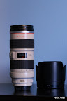
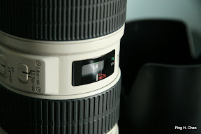
My subject was my favorite (and most expensive....) lens, the Canon EF 70-200 2.8 IS lens. This probably wasn't my first choice in subject, but it worked out none the less. I knew I wanted to get some close up shots of the lens, the writing on it, the different controls, etc (which I did get, but nothing amazing there). I then realized a major flaw in my subject.... it is a cylinder! No matter how I walk around it, it looks practically the same! I had to cheat a little bit and move the lens around and thats when I started having more fun...


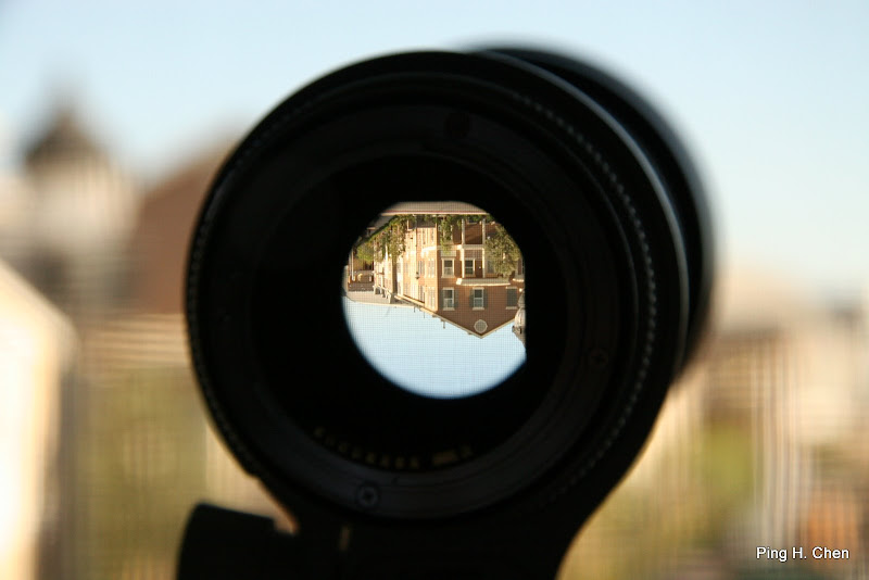
This is probably my favorite shot from the entire set. I had this shot in mind when I first thought of using a lens as my subject but I didn't know how it'd turn out. I was really surprised that you can get it to focus so clearly in the center while blurring everything else around it so its a nice creamy background. The fact that the image was inverted was definitely a pleasant surprise... I had no idea but I guess it makes sense ;). I've only looked through this thing while its on a camera through the view finder, it is definitely a different experience to look through it through another lens :). The window screen also ended up helping the image quite a bit I think. When blurred, it adds a bit of texture and makes the center focused part just look... different. Not quite sure how to explain it :).

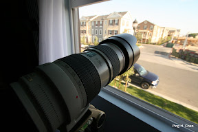
And finally here is the Canon "cannon". I like the distortion effect, making the lens look much bigger than it actually is (well, maybe not "much" :)). I just like the feeling of it pointing outwards... looking over the neighborhood.

Rest of the photos available here: http://picasaweb.google.com/smophotoclub/Pingc1/. I had a lot of fun doing the assignment and thought everyone else's photos turned out really well too. Now I'm excited about assignment two...